
Introduction
In the modern digital landscape, corporate logos surround us everywhere we look. From the smartphones in our pockets to the cars driving down the highway, brand symbols dictate much of our visual consumer experience. However, graphic designers and branding agencies often pack these seemingly simple images with layers of clever symbolism, secret meanings, and optical illusions. While most people glance at a logo and register only the surface-level brand name, looking closer can reveal fascinating design choices that change how we perceive a company entirely. From high-end automotive brands to global tech giants, uncovering these hidden secrets offers a captivating look into the world of creative design and corporate storytelling.
The Art of Subliminal Logo Design
Corporate identity design is a high-stakes business discipline. Companies invest millions of dollars into developing a visual symbol that communicates their core values, history, and ambitions instantly. Subliminal messaging in logos relies on negative space, geometric alignment, and historical references to engage the viewer’s subconscious mind. When a logo contains a hidden double meaning, it creates a “lightbulb” moment for consumers, boosting brand recall and sparking viral discussions online. This kind of creative engagement is a powerful tool for driving organic web traffic and building long-lasting consumer trust.
Exploring Hidden Meanings in Iconic Brand Symbols
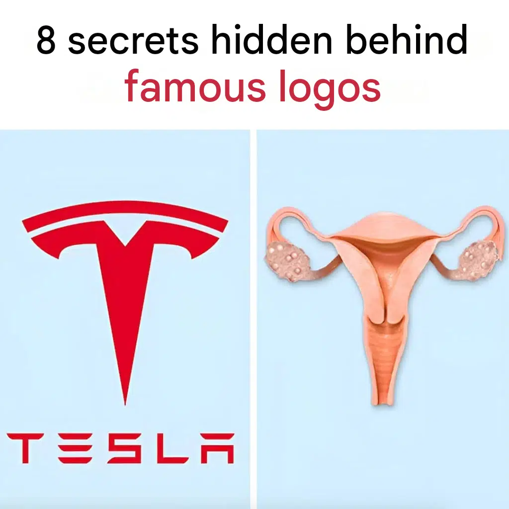
While the internet loves sharing viral comparisons—such as the humorous structural resemblance circulating between certain corporate emblems and anatomical illustrations like the Tesla logo and the female reproductive system shown above—real logo design secrets are often masterclasses in strategic geometry. Let’s examine how some of the world’s most famous brands hide clever details in plain sight.
1. The Hidden Arrow in FedEx
One of the most famous examples of negative space design is found in the FedEx logo. If you look closely at the white space between the letters “E” and “x”, you will notice a clean, forward-facing arrow. Designers deliberately chose a font that forces these two letters together to create this directional shape, subtly communicating forward motion, speed, precision, and reliability in package delivery.
2. The Amazon A-to-Z Smile
At first glance, the Amazon logo features a simple wordmark with an orange curved line underneath. However, that line is actually an arrow pointing from the letter “A” to the letter “Z”. This clever design signifies that the retail giant sells everything from A to Z. Additionally, the arrow is shaped like a smiling face, ensuring consumers associate shopping with a positive, satisfying customer experience.
3. The Baskin-Robbins 31 Flavors
Baskin-Robbins introduced a vibrant pink and blue logo that features a stylized number “31” embedded right inside the initials “BR”. The portions of the letters “B” and “R” that stick out are colored pink to explicitly form the number 31, representing the famous promise that customers can enjoy a different ice cream flavor every day of the month.
4. The Toyota Triple Ellipses
The Toyota emblem is instantly recognizable, but many do not realize that the overlapping ovals represent more than just a stylized “T”. The three ellipses combine to symbolize the overlapping of the heart of the customer and the heart of the company, with the background space representing global expansion and technological advancement. Furthermore, every individual letter of the word “TOYOTA” can be spelled out using the internal shapes of the logo grid.
5. The Toblerone Hidden Bear
The Swiss chocolate brand Toblerone features a majestic mountain on its packaging, representing the Matterhorn. If you examine the illustration closely within the white rock face, you will spot the silhouette of a dancing bear. This is a clever nod to the city of Bern, Switzerland—known as the “City of Bears”—where the chocolate was originally manufactured.
Financial and Economic Impacts of Rebranding
Developing, refining, or redesigning a corporate logo is a major financial investment for any enterprise. Companies do not alter their visual identities lightly; rebranding campaigns require extensive market research, consumer psychology testing, and massive advertising budgets. A successful logo refresh can revitalize a stagnant brand, attract younger demographics, and increase overall market valuation.
Conversely, a poorly executed logo change can alienate loyal customers and lead to a drop in stock value or consumer confidence. For investors and market analysts, monitoring corporate rebranding initiatives provides a unique window into a company’s strategic direction. Ensuring that a company’s intellectual property is legally protected also involves careful legal considerations, trademark filings, and working closely with an attorney to secure exclusive rights to these valuable visual assets.
The Intersection of Design and Consumer Psychology
Why do hidden logo secrets capture our attention so effectively? The answer lies in human psychology. Our brains are hardwired to solve puzzles and recognize patterns. When we spot a hidden arrow, a secret animal silhouette, or a clever double entendre within a brand logo, our brains release a small burst of dopamine. This rewarding feeling makes the brand more memorable.
In the digital age, this psychological trigger is heavily exploited by social media creators. Content highlighting optical illusions or surprising visual facts consistently achieves high engagement rates, shares, and comments. Understanding these design mechanisms helps marketers craft better digital content and helps consumers become more visually literate.
Practical Tips for Analyzing Visual Content Online
- Look Closer: Never take viral images at face value. Zoom in on negative spaces, color contrasts, and background shapes to find hidden details.
- Research the History: Many logo secrets are intentional homages to a company’s founders, original city, or early business model.
- Check the Source: Always verify whether a viral comparison is an official corporate design choice or an internet meme blending humor with brand imagery.
Interesting Facts About Corporate Logos
- The Minimalist Trend: Over the past decade, major brands like Google, Mastercard, and Warner Bros have shifted toward flat, minimalist logo designs. This shift is primarily driven by the need for logos to look crisp and legible on tiny smartphone screens rather than large billboards.
- The Cost of Simplicity: Some of the most expensive logos in history cost millions to design. For instance, BBC spent vast sums on its simple block lettering, while the iconic Nike swoosh was originally purchased from a graphic design student in 1971 for just $35.
- Color Psychology: Colors dictate emotional responses in branding. Fast-food giants frequently use red and yellow because psychological studies show these colors stimulate appetite and urgency, whereas tech companies favor blue to convey trust and security.
Conclusion
Famous logos are much more than simple corporate decorations; they are intricate works of visual art packed with history, psychology, and hidden meanings. Whether it is a clever negative-space arrow pointing toward the future or a viral internet observation comparing structural shapes, exploring the stories behind these designs enriches our everyday consumer experience. By understanding the strategic depth behind corporate branding, we gain a greater appreciation for the creative minds that shape our visual world, protecting valuable corporate investment and influencing how we interact with global commerce every single day.
FAQ Section
1. Are all hidden meanings in logos intentional? Most hidden meanings—such as the FedEx arrow or the Amazon smile—are entirely intentional and created by professional design agencies after months of research. However, some online comparisons, like viral memes pointing out structural similarities between logos and anatomical forms, are purely coincidental or humorous interpretations created by internet users.
2. Why do companies change their logos over time?
Companies update their logos to modernize their brand image, adapt to new digital display technologies, appeal to younger generations, or reflect a shift in their core business model and services.
3. How much do companies typically spend on a new logo?
The cost varies dramatically. Small businesses might spend a few hundred dollars on freelance platforms, while multinational corporations routinely invest hundreds of thousands—or even millions—of dollars into comprehensive rebranding campaigns, consumer testing, and global trademark rollouts.
4. Can a logo design protect a company from legal disputes?
Yes, a unique and legally registered logo serves as a vital trademark. Working with a qualified attorney ensures that a company’s visual identity is fully protected against copyright infringement, counterfeit products, and unauthorized use by competitors, safeguarding corporate assets and financial health.
5. How do colors affect logo recognition?
Color is often the first element the human brain processes when viewing a logo. Studies show that color accounts for up to 85% of a consumer’s initial impression of a brand, making color selection a critical component of marketing and consumer psychology.
6. Do minimalist logos perform better in digital marketing?
Yes. In an era dominated by mobile browsing, clean, flat, and simplified logos scale down effectively to tiny app icons and social media profile pictures without losing recognition value.
7. Where can I learn more about graphic design history?
There are numerous design documentaries, books on visual communication, and museum archives dedicated to the evolution of corporate identity and graphic design history.
